Prism: Color Library for Dart & Flutter
Prism is an optimized, zero-dependency color manipulation library for Dart & Flutter with multiple color models, accessibility tools, and pre-built palettes.
I've always been fascinated with colors and color theory. I've designed a board game and an app around it, and in my amateur artworks I seem to subconsciously gravitate to complementary palettes (examples: 1, 2, 3). Over the years I've written a couple of unpublished color libraries. The first was Chroma which I later replaced with Pigment, which I rebranded as Prism due to a name clash. The rebrand gave me a good excuse to spend a bit of time refactoring it and polishing it. I'm pleased to announce Prism is now available over on pub.dev and github. While the concepts aren't new, Prism is a comprehensive and thoughtfully designed package that makes working with modern color spaces in Dart really easy.

✨ Back in 2015 I spotted this orange and blue banding on my tablet's screen providing a little real-world demonstration of the color theory that I was reading about! 🧡💙
To understand what makes prism useful I need to briefly explain color spaces. These are systems for describing and storing colors:
RGB - The Color Model of Screens
Your phone or laptop screen creates colors by mixing light. Each pixel is made of tiny red, green, and blue sub-pixels (RGB). If all are off, you get black; if all are on full, you get white. This is great for screens, but it's not very intuitive for humans.
If you want to make a color lighter or change its hue, you're just fiddling with Red, Green, and Blue values. Worse, if you try to create a gradient between two colors in RGB, you often get a muddy, greyish color in the middle. This is because the math of RGB doesn't match up with how our eyes actually perceive color and lightness.
Color spaces like HSL and HSV were created to make manipulating RGB colors easier. However, they are fundamentally flawed, as their handling of lightness and value is inconsistent across different hues.
Oklab + Oklch - A More Human Approach
This is the problem Oklab and Oklch are designed to solve. They are modern color spaces built around how humans perceive color, focusing on three things:
- L - Lightness (how light or dark it appears)
- C - Chroma (how vibrant or intense the color is)
- H - Hue (the actual color, like red, green, blue)
The magic is that "Lightness" in Oklch is perceptually uniform. This means you can change the hue or chroma and the perceived lightness won't change. This is a game-changer for creating accessible UIs with proper contrast, and for creating beautiful, vibrant gradients that don't turn to mud.
While the math behind this is complex (I used the brilliant formulas from Björn Ottosson's post to handle gamut clipping), but Prism abstracts all that away.
Hopefully the above gives you a little overview of why a dedicated color library is useful. Prism provides a really easy way to create, manipulate and store colors. Prism currently supports Rgb8, Rgb16, Hsl, Hsv, Oklch and Oklab color spaces, and makes it trivial to convert between them. Here's a little example:
// Create an rgb color from hex and convert to oklch
final red = RayRgb8.fromHex('#FF0000');
final redInOklch = red.toOklch();
print(redInOklch);
// RayOklch(l: 0.628, c: 0.258, h: 29.2°)

// A darker red (with perceptually uniform lightness)
final darkRed = redInOklch.withLightness(0.3);
print(darkRed);
// RayOklch(l: 0.300, c: 0.089, h: 29.2°)

// let's take it back to rgb to print the hex
final darkRedInRgb = darkRed.toRgb8();
print(darkRedInRgb.toHexStr());
// #521711
Notice that the final rgb hex color (format: #RRGGBB) actually has a bit of green and blue to create the darker red.
Palettes
Prism also has a palette system, this allows developers to have palettes with pre-calculated luminosity levels with RGB or OKLCH colors (this is particularly useful when working with RGB palettes as runtime calculations can be expensive). The palette sources can be pre-defined such as Material Colors, Open Colors, Tailwind or can be pre-computed using Prism (the Prism palette is called Spectrum). Spectrum builds on the Google's Material Colors system (which offers shades from 50-900 in multiple colors) but expands it at both ends to offer shades from 0-1000 giving more choice at the extremes of the spectrum, great for doing really light/dark themes. I've also expanded the color choices with hues at 15° intervals around the color wheel. The result is a palette with more nuance at the lightest and darkest extremes, as you can see in the comparison below:
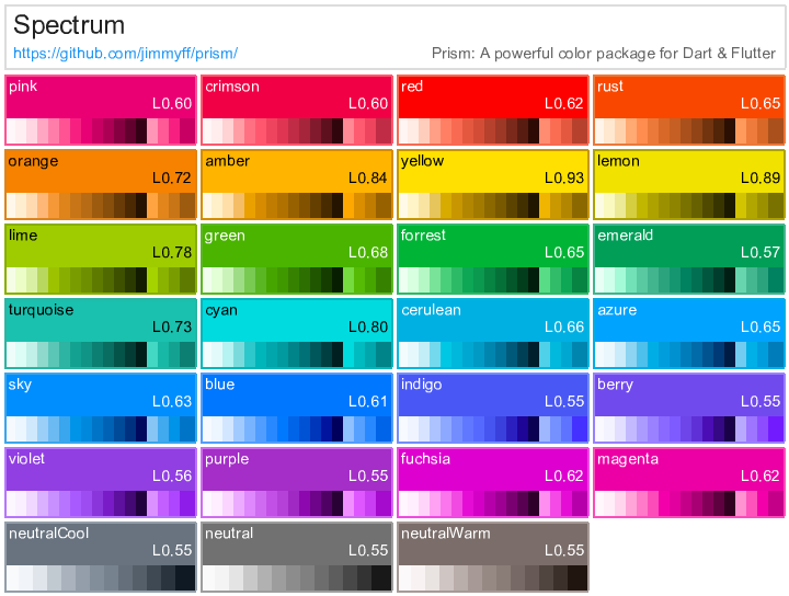
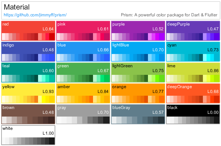
As a little bonus all the palettes are compiled to css and available on github in both RGB and OKLCH formats.
What's next
I've not finished porting over the Pigment library to Prism, there is still the color theory code to migrate. I use color theory to calculate palettes based on images by extracting the dominant colors and choosing aesthetically pleasing combinations of colors. Before I port this over I need to consider my approach as at the moment prism and prism_flutter require zero dependencies and i'd like to keep them that way. I'll probably add a prism_image_analysis package at some point which will have the package:image package dependency.
You can find Prism on pub.dev and github. Prism Flutter is also available on pub.dev and github.